This is our third blog in our affordable BI series.
Google Data Studio is a dashboard and reporting tool that is very simple to use, customize, and share via your Google Sheet drive or through email. It also allows you to transform your data into appealing and informative reports for your customers, team members, and management.
Google Data Studio can quickly turn your financial data generated by the G-Accon tool into illuminating, visually appealing, easily comprehendible, sharable, and fully customizable dashboards and reports.
Google Data Studio also provides a perfect way to present data on your website. It is easy to seamlessly connect your G-Accon generated Xero, QuickBooks, or WorkflowMax financial data from Google Sheets. You can effortlessly transform your raw data or final reports into the metrics and dimensions in easy-to-understand reports and dashboards. One more bonus? There are neither code or queries required.
Google Data Studio provides different kinds of visualizations to represent data in a graphical manner such as bar charts, line charts, combo charts, pie charts or tabular format. You can change the style of the various aesthetics like font size and background color and you can also insert an image logo of your company.
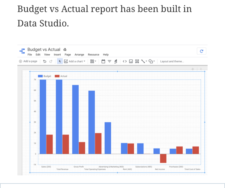
Here is an example of a Data Studio bar chart that represents a Budget vs Actual report generated by G-Accon.
Google Data Studio allows you to build these beautiful, custom dashboards for a variety of data and analytics. Google Data Studio makes it practical and affordable for anyone to create custom dashboards that pull from multiple sources. You can add a variety of data sources and create charts, graphs, and multiple financial reports generated by G-Accon to design your dashboard.
Your financial reports and dashboards can also be published on your website.
The beauty of using Data Studio in conjunction with G-Accon is that all of your refreshed data will be automatically updated in your Data Studio charts or your dashboard. For basically minimum effort and cost, you’ll be able to get this amazing data visual representation so you can focus on what really matters - your company’s success.